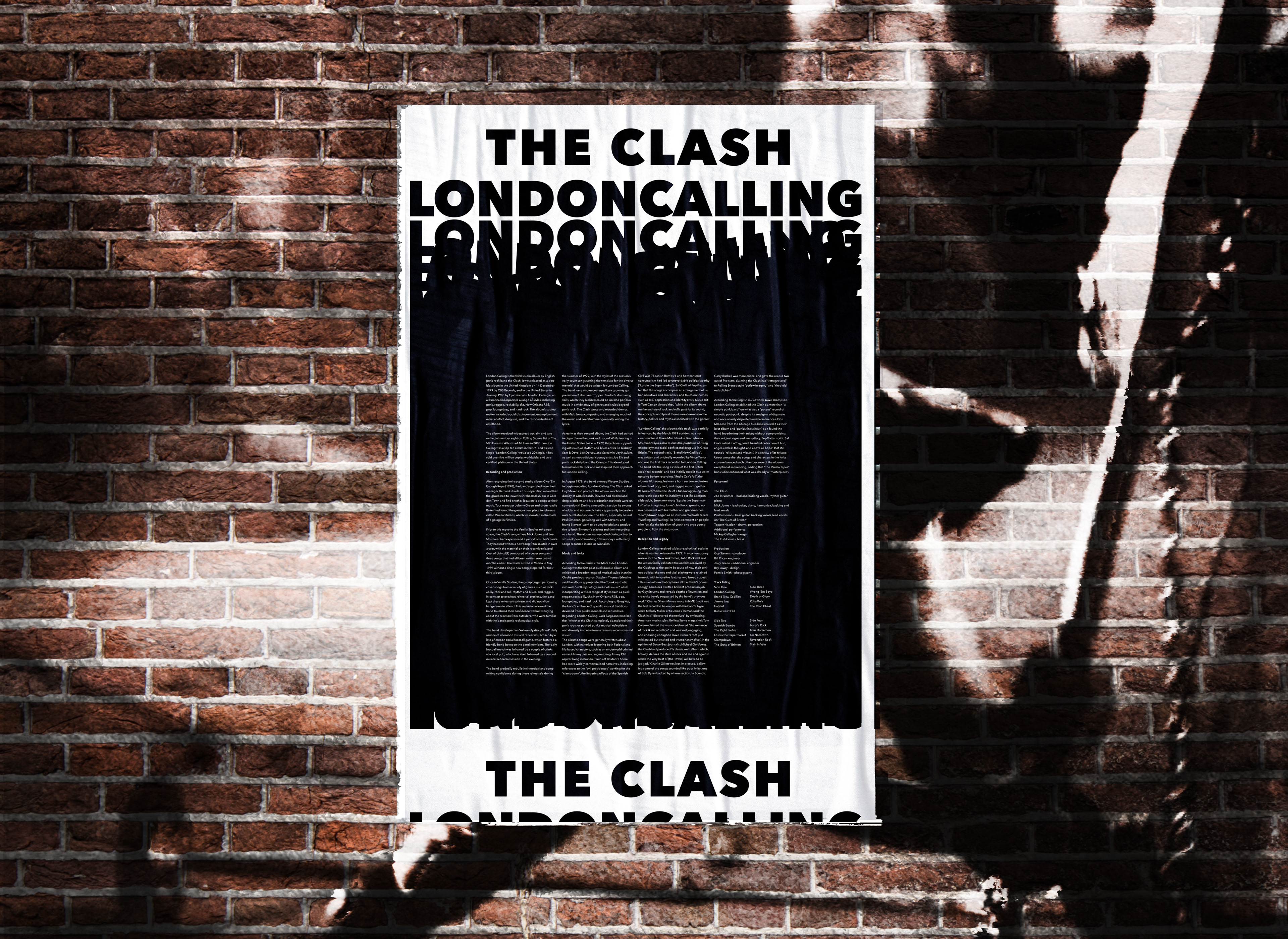
This project was to create a poster to represent an album from a band that was chosen for us. The restrictions on this project was to make it only in black and white or grayscale and only use typography. Typography was the only form of imagery that we could use to make the poster feel expressive to the style of the album and band. We were also supplied with around 1600 words to have on our poster that talk about the album. The poster has to be expressive enough to represent the album and pull in readers to look at it but also be legible with a lot of text on it. My progress and other variations are below.
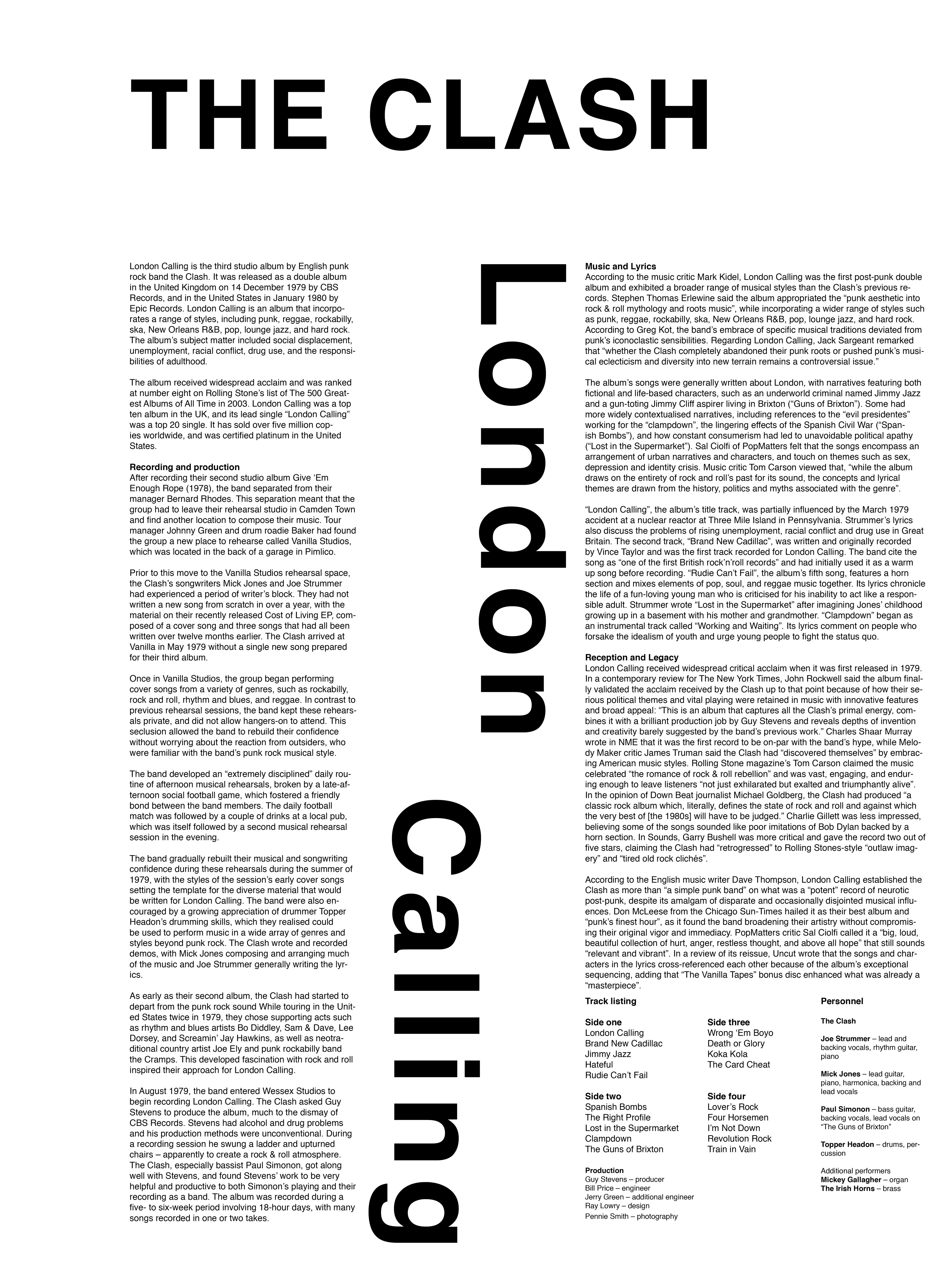
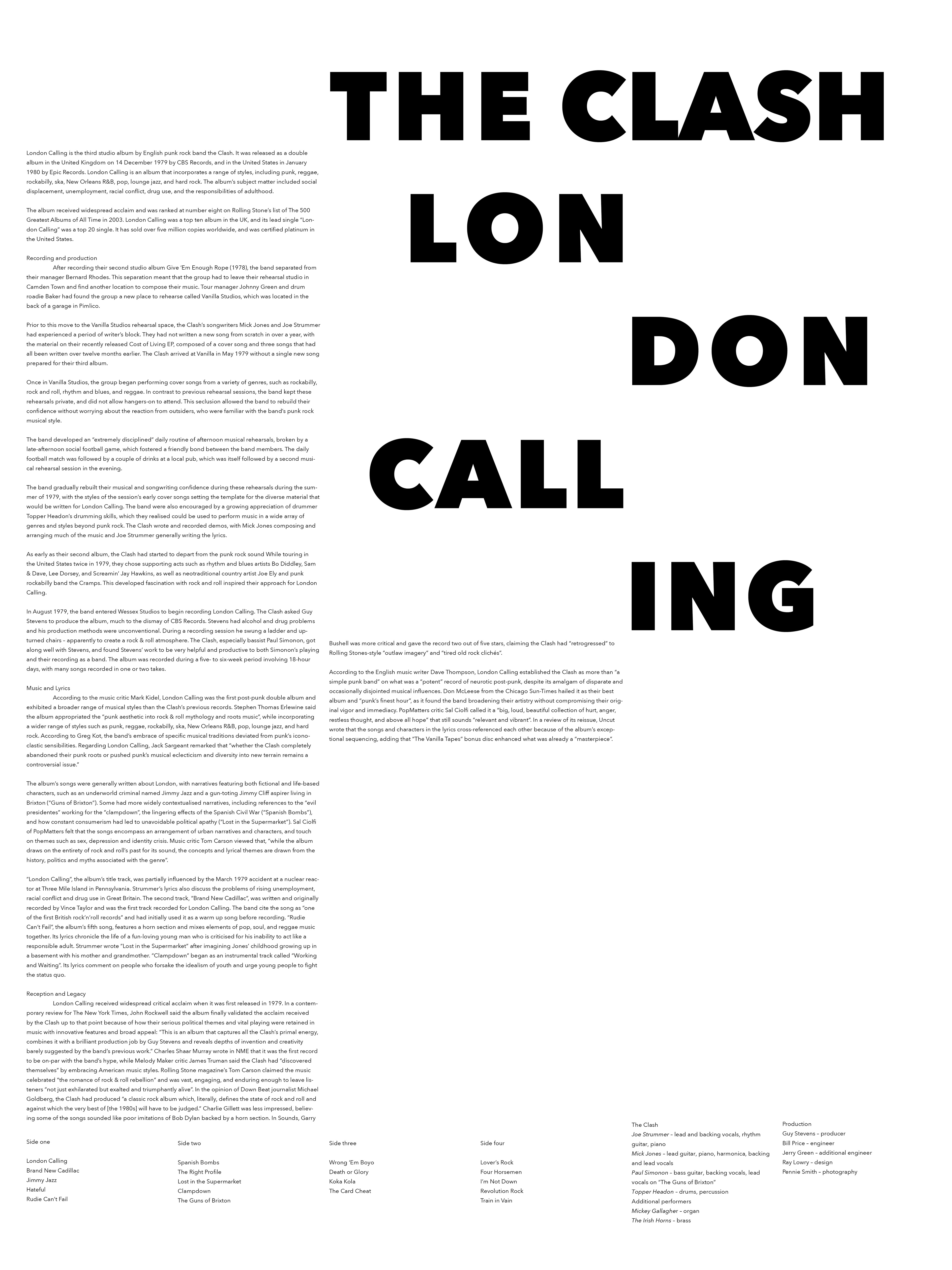
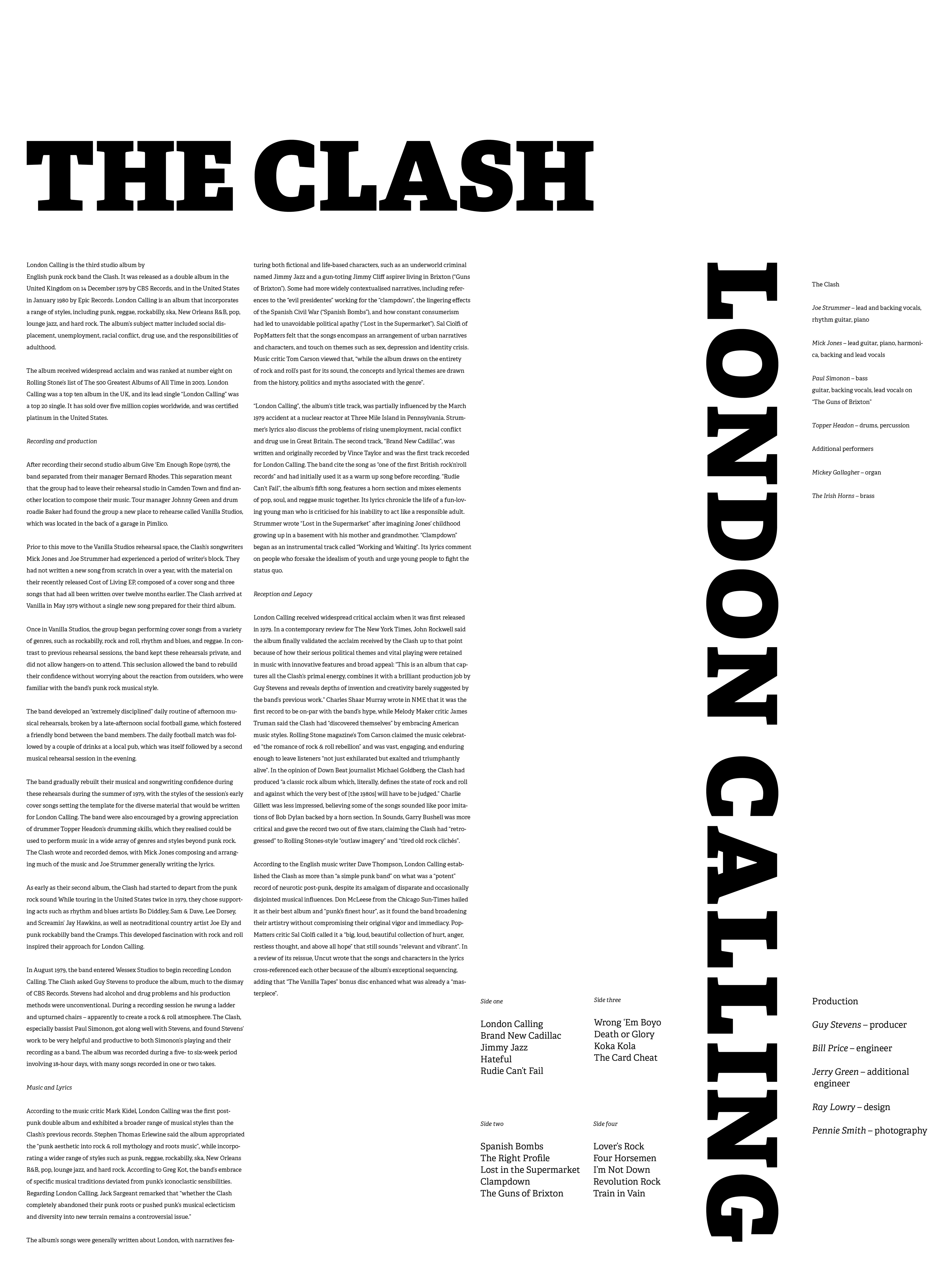
These three are a first draft of the project. In this stage I played with different typography and laying out the content.


After playing around with different styles of laying out content, I decided to make versions of designing the album name and band name. I focused on different ways that I could make it expressive.
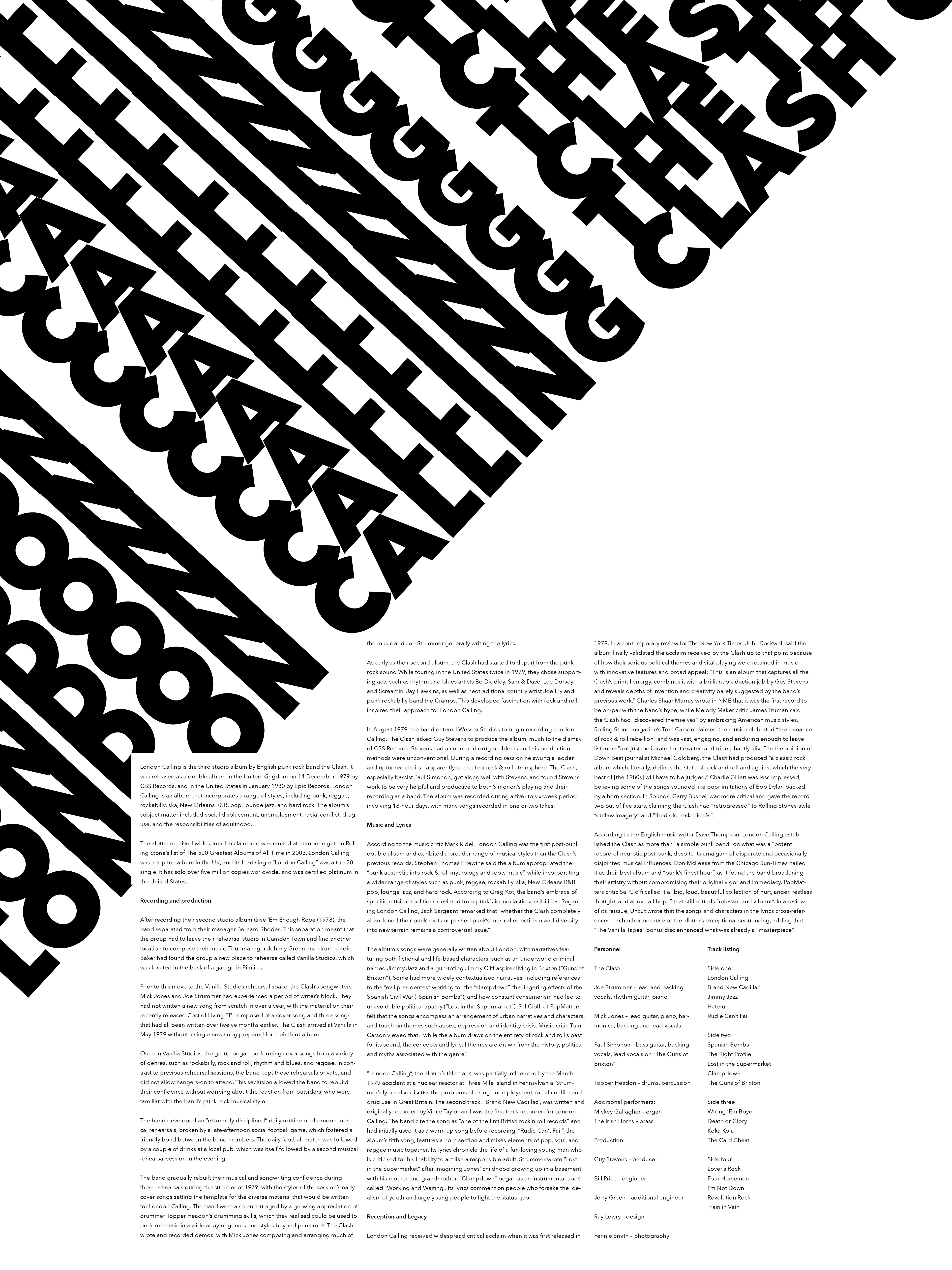
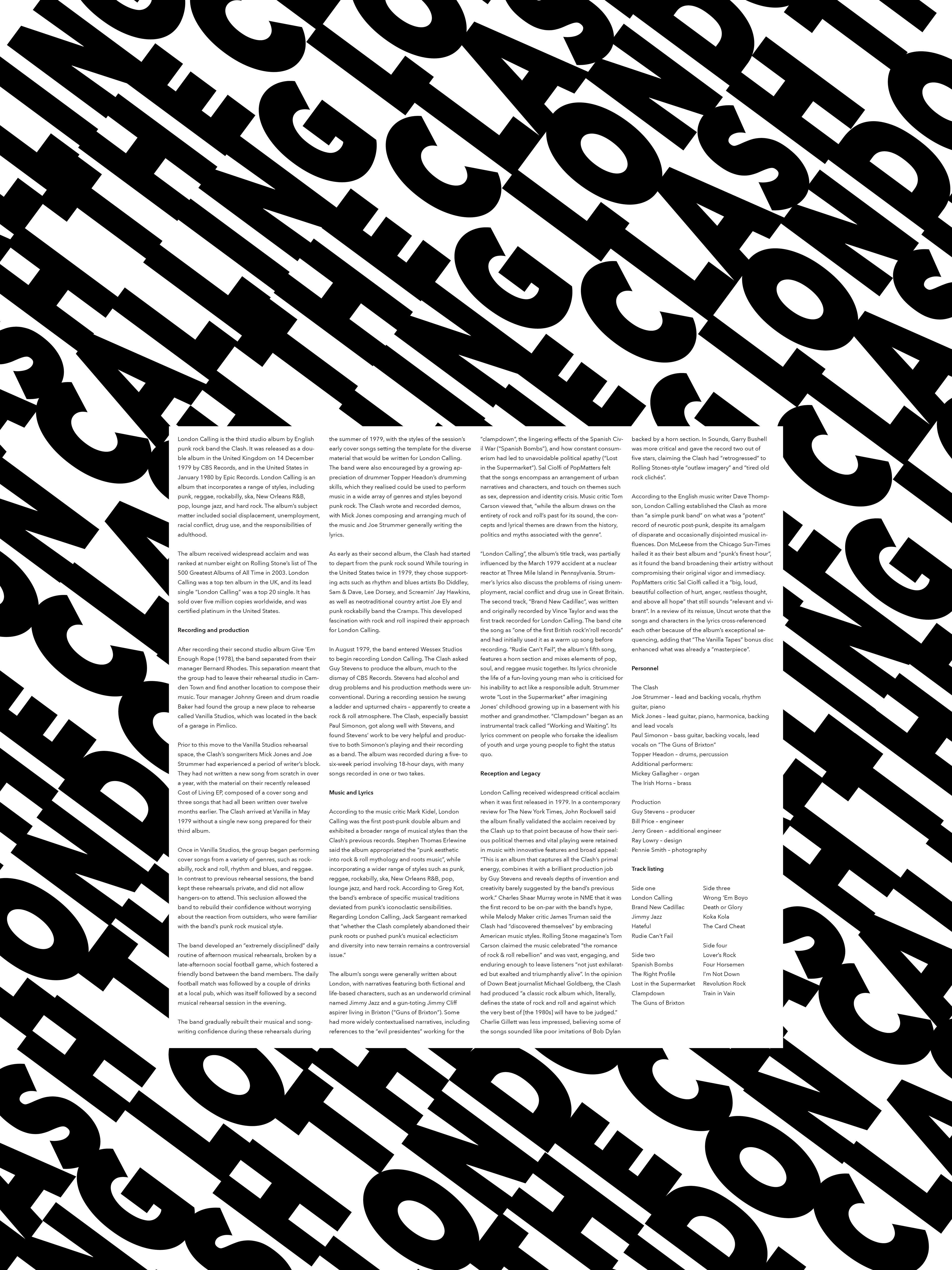
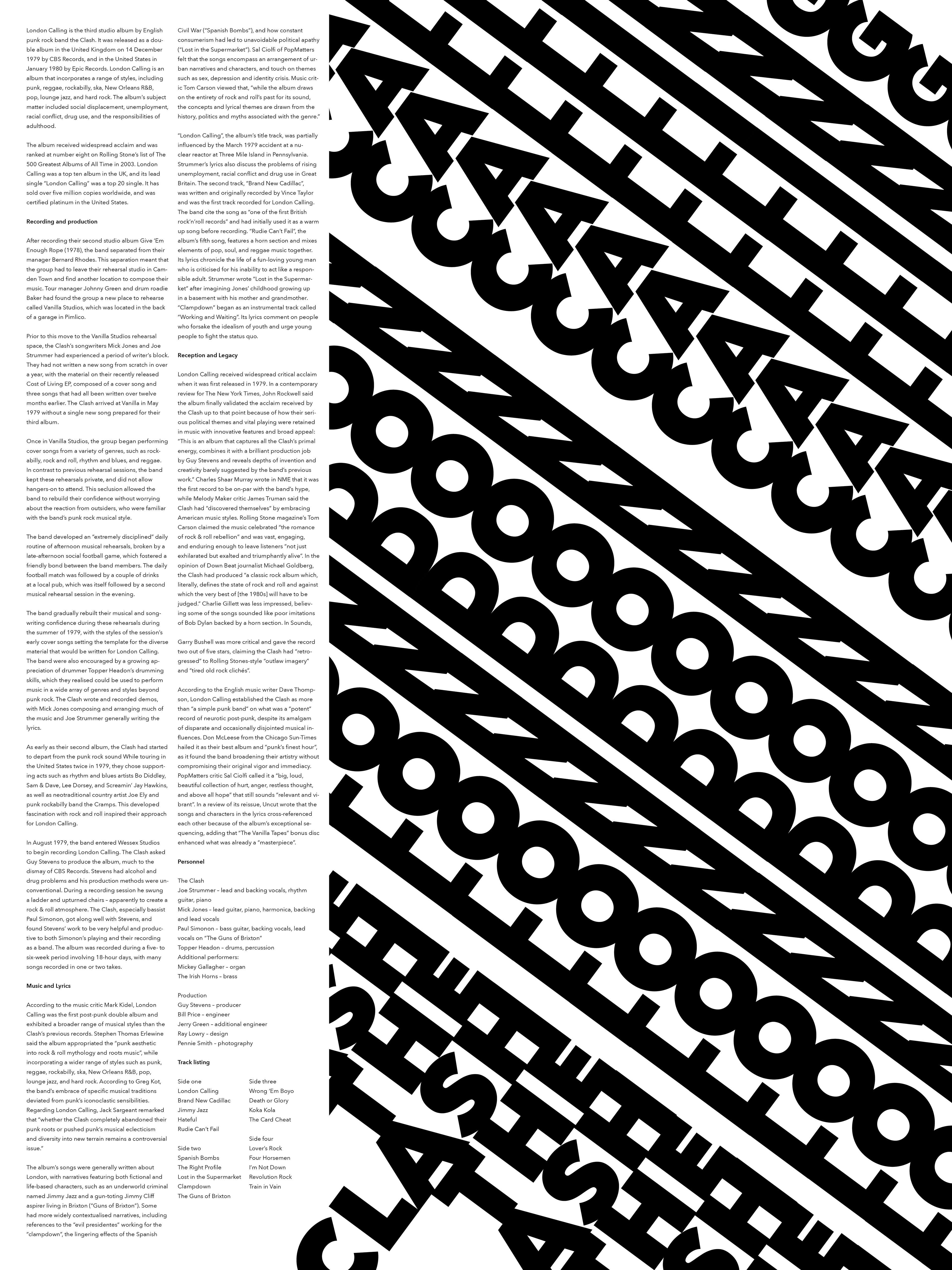

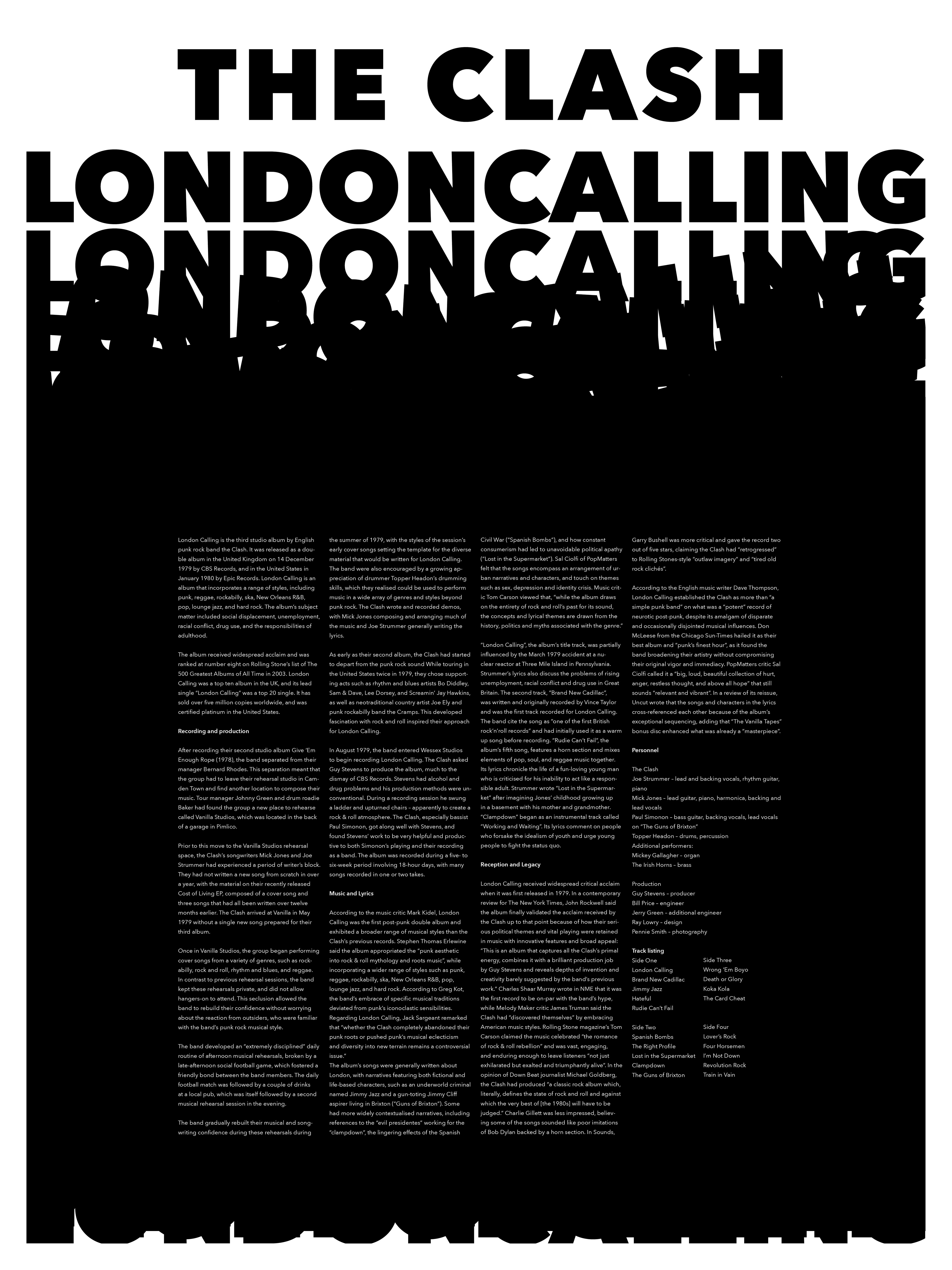
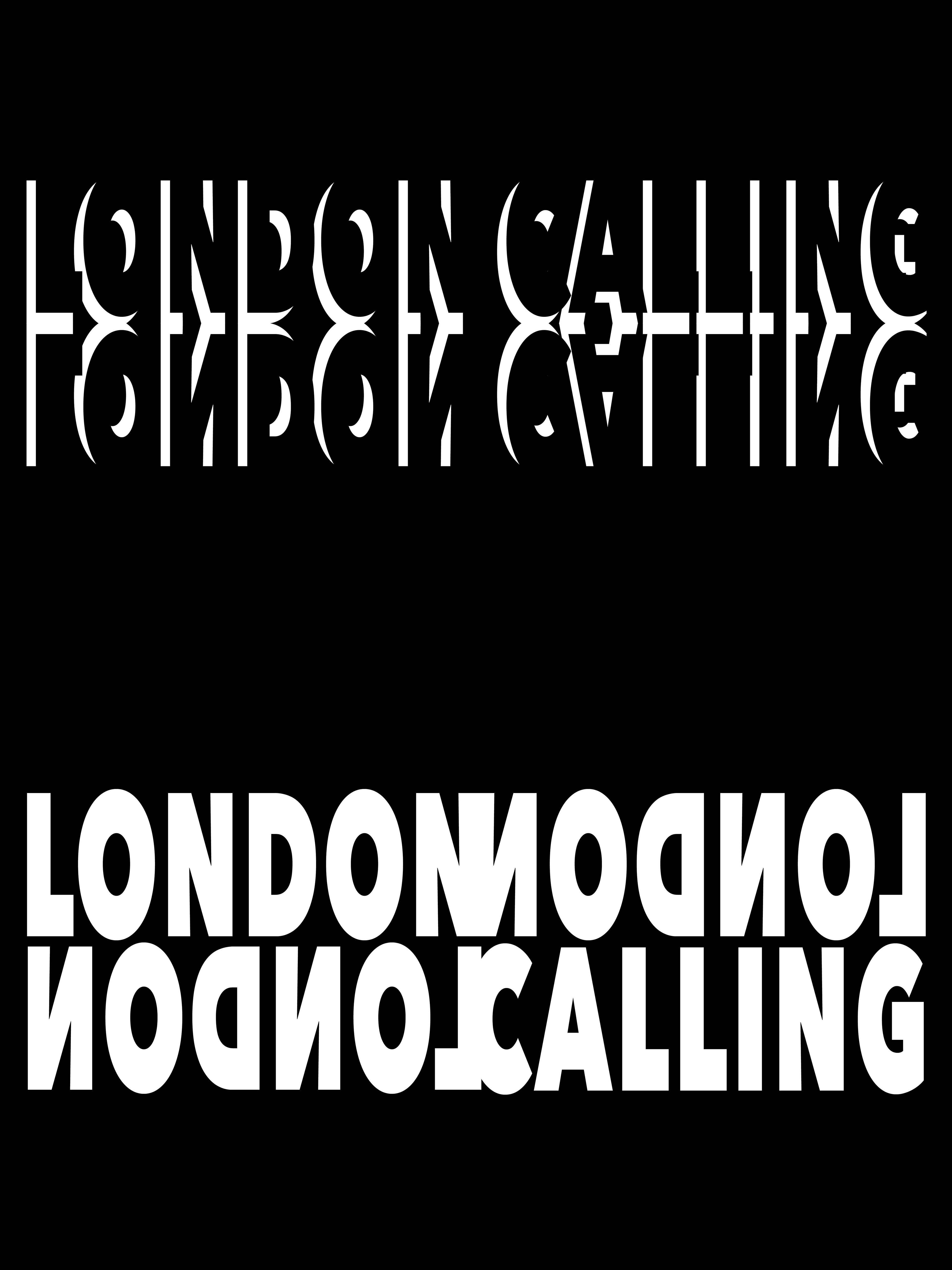
Here I started to narrow down my styles and tried different ways to represent the music in a "rowdy" way. I found that repeating the type helped convey the feeling of rowdiness. From this I got to my final solution for my poster and stuck within the restrictions of the project.