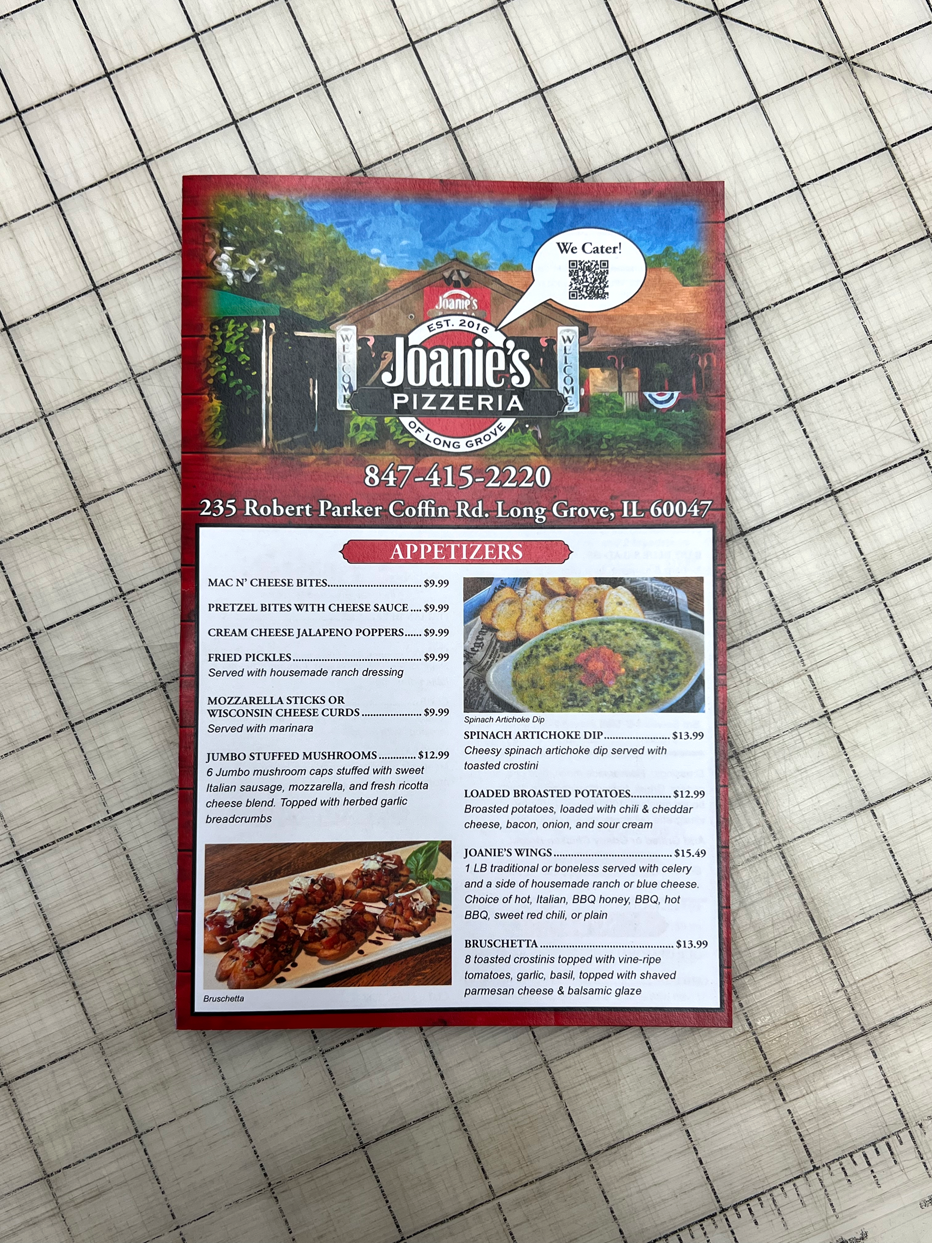
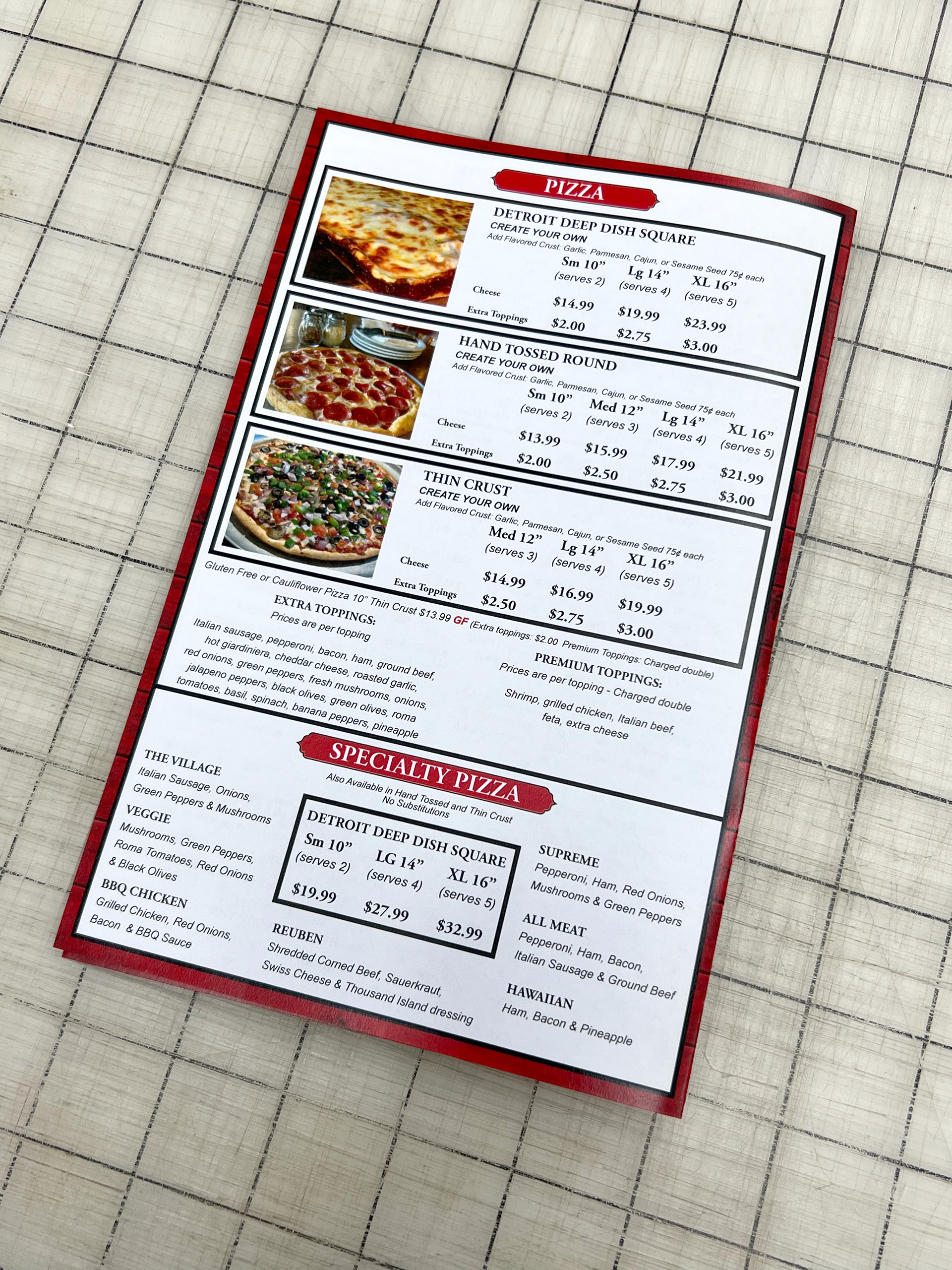
For this menu design, the restaurant, Joanie’s Pizzeria wanted to redesign their menu while having no previous artwork from it. After talking with the team there, I understood that they wanted a rustic look and almost farmhouse feel to it. After looking at the old physical copy, I started to create artwork to help convey their feel while making the menu easier to read.
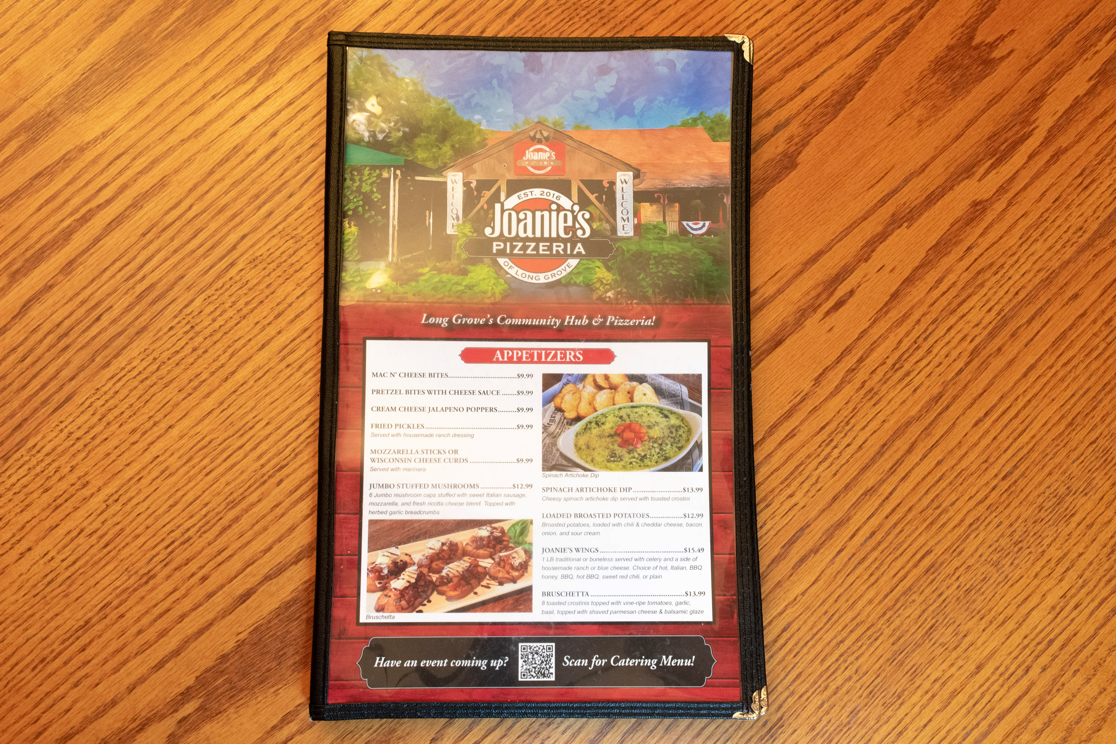
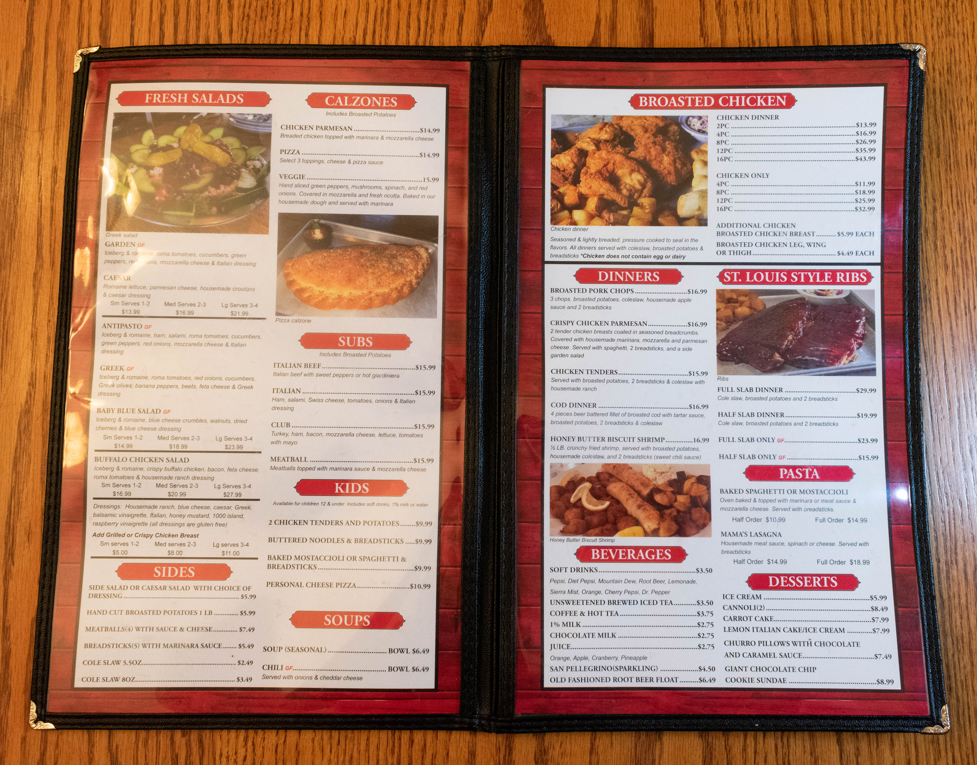
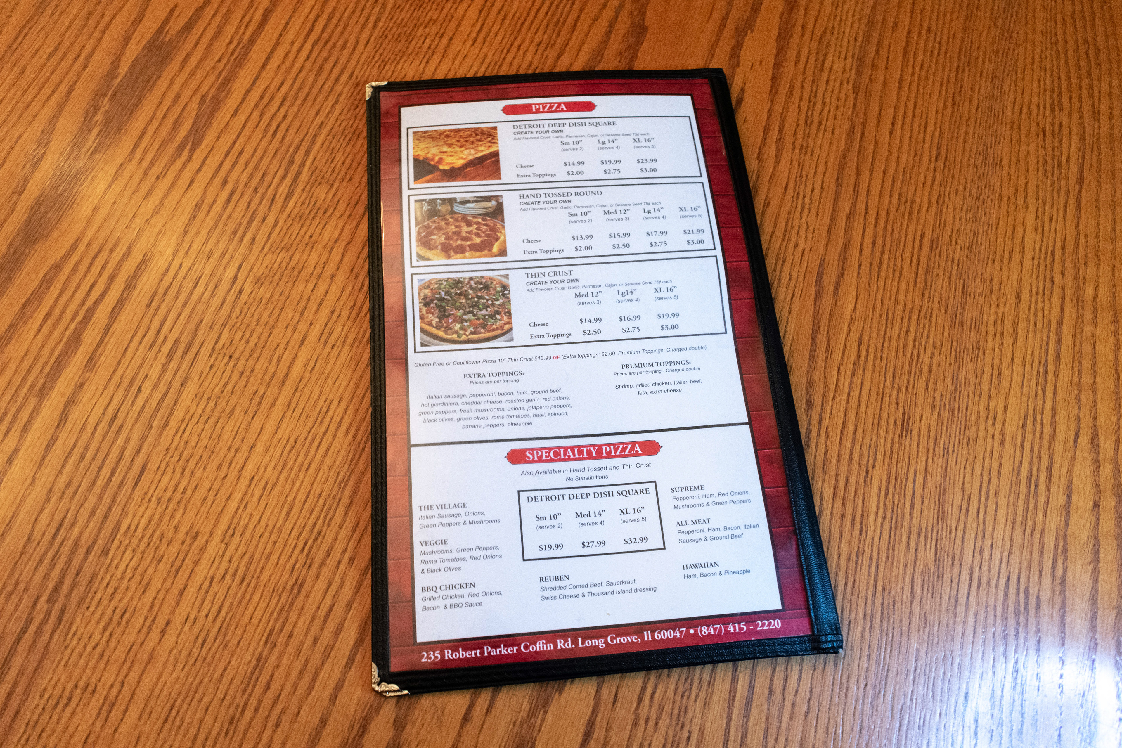
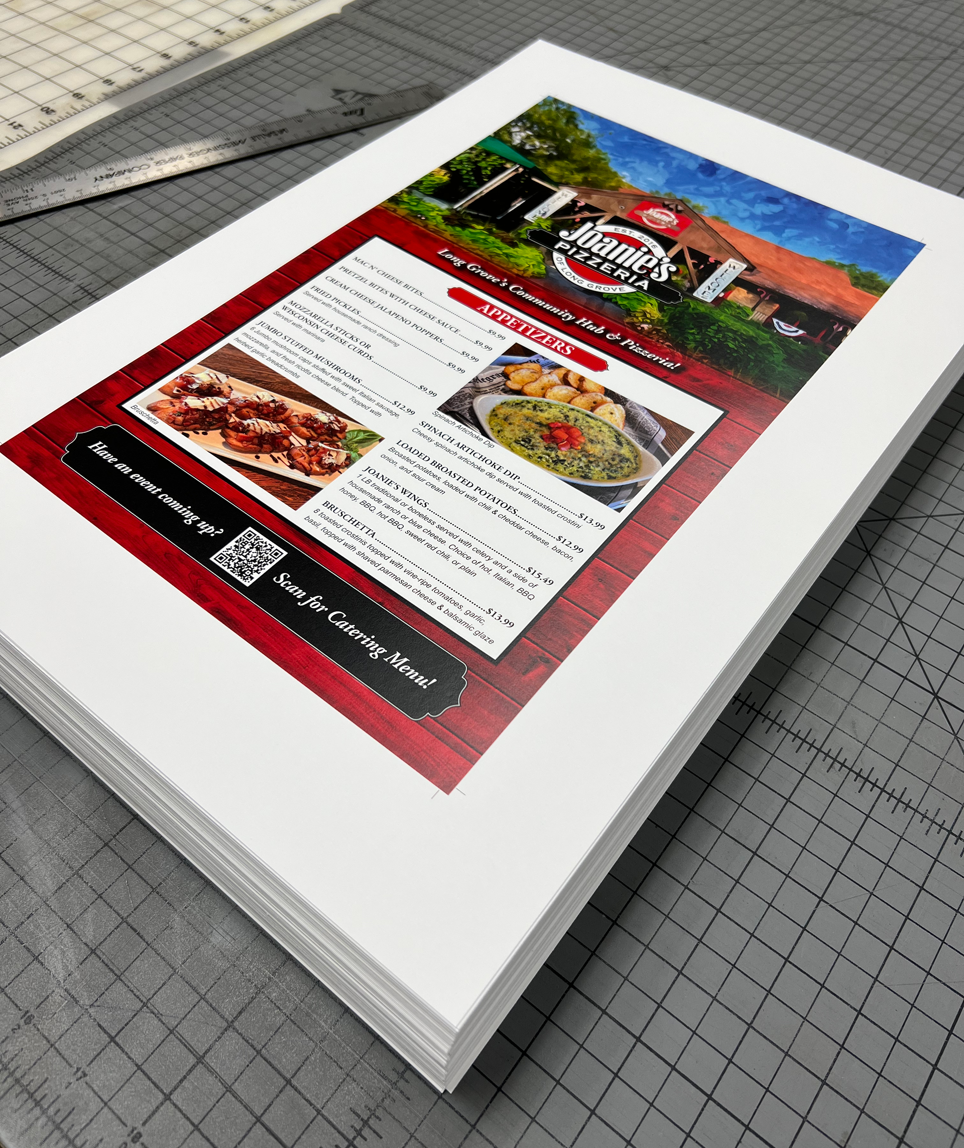
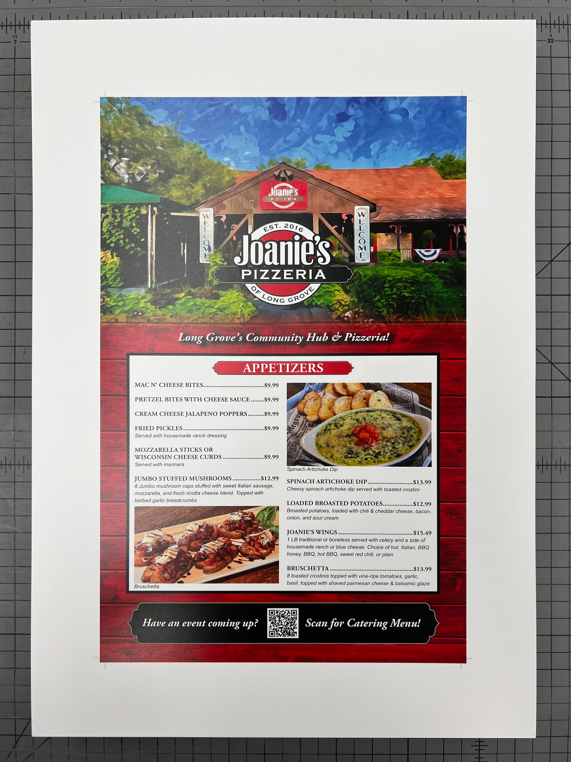
Once the physical menu was nailed down, it went into production where we printed and cut the menu down to size. As that was completed, we started on the next stage which was to create a take out menu. After going through some layouts and seeing how much space I would need to fit the menu, we decided on a size. The take out menus are cut to 8.5 x 11 with a bi-fold to 5.5" x 8.5" which gave me enough space to layout the menu and keep it easily readable. Some of the artwork stayed the same and there were others that I edited to better suit the take out menu.
