For this project, we started brainstorming as a group about how things at DePaul could be better or improved. We narrowed it down to the idea of how students get feedback and is it actually helpful. So we all went and talked to different students and people with different majors. From the data we gathered, students want more feedback on their work but are not always good about asking for it in class as well as not having enough class time to get enough feedback on work. We decided it would be a good idea to make a mobile application for students to post their work and get people to review it. From design projects to papers, and anything in between.
After collecting data from the interviews that each member collected, we sorted all of it out. We made an affinity diagram based off of what the user needs and motivations are or would be. We split the data into categories to help organize it all and make more sense to us and how we will use the data. From all of this stage with the data, we made 9 different insights that led us to 5 design principles that would direct us in making the mobile application. Our design principles are;
1. Allow users to give and receive feedback on work from all disciplines.
2. Ensure that students get their work reviewed in a timely fashion.
3. Ensure that work can be reviewed by credible sources.
4. Provide a safe, comfortable environment for work to be reviewed.
5. Permit users to set guidelines on the feedback they receive.
After narrowing down our design principles, we made story boards to map out how the user would use and interact the mobile application that we were creating. We also started to make different user stories and tasks that you would be able to complete while using the app.
Once we started on the development of the application, we made a paper prototype to help get our ideas down and with the ability to change things quickly. This helped us get more situated with how the interface will be and we went through user testing to help get critical feedback on what needs to be changed.
Once we received feedback on the paper prototype, we went into Axure to make a mid fidelity prototype of the application and used wireframes to figure out how the things would look and how different pages would connect to each other. We stuck to mostly using grayscale but also incorporated some color that would then be included in the high fidelity prototype. We again did user testing to see what worked and what confused the users, from buttons to different wording so that we could make it as user friendly as possible.
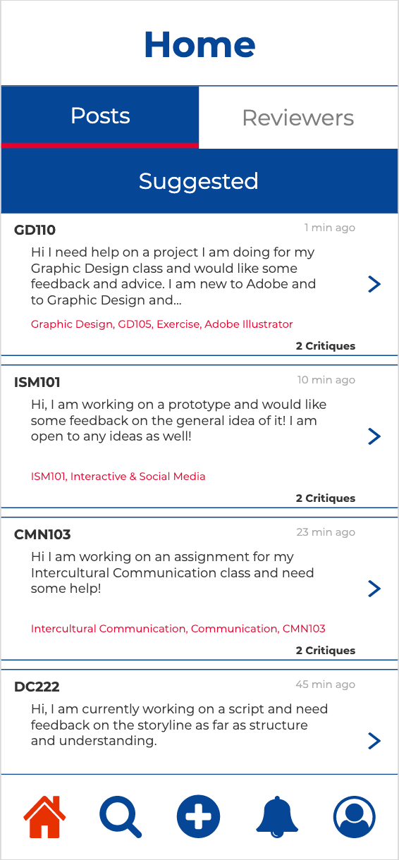
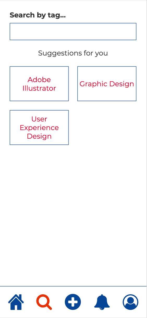
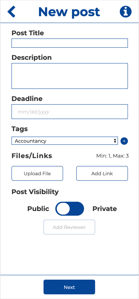
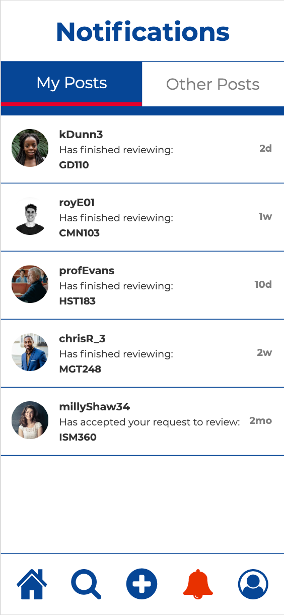
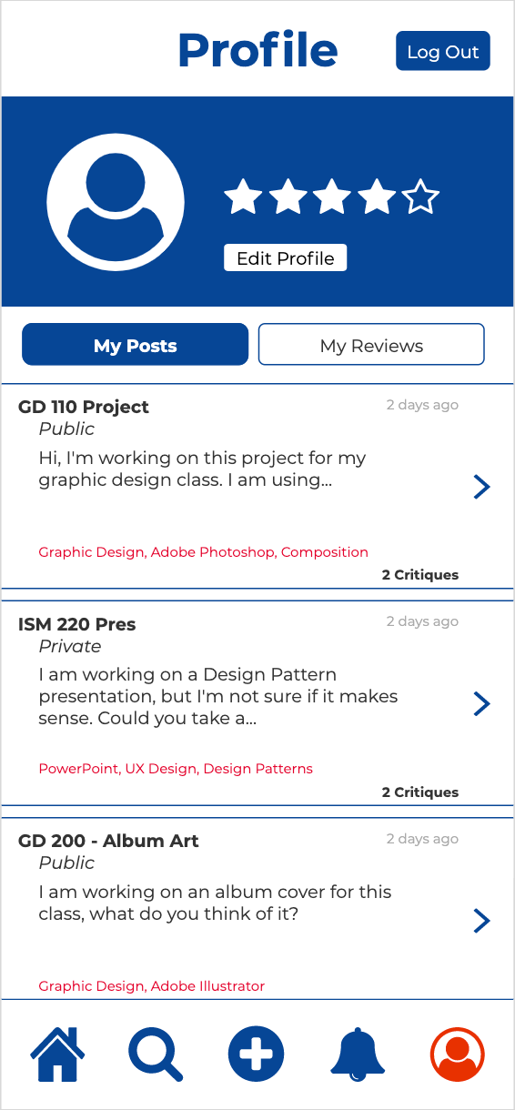
Once we had our mid fidelity prototype down, we moved onto our high fidelity model and worked on making it highly functional and stylized. We set our color pallet, typography, and style that we wanted to used so we could start making it look very high fidelity. Again, we did user testing on the application to see if it was working with the changes and stylizations that we made to it. After refining and refining the prototype, we came to a solution to the problem that we originally brainstormed about. Now students would be able to post their work on this mobile application to get feedback, they can post it to everyone or select a few people to just review it. Professor could also join the application to give feedback to students of their or maybe students that will be taking their classes in the future.
Reflection
This was a very fun learning experience for a group project. Each of the 4 members of our group have different majors, so we each have different backgrounds, perspectives, and specialities. Working together we each were able to show our strengths and weaknesses with being able to help out more in our area of specialty. This project was worked through the majority of a ten week trimester which came with time limitations as we could have spent even more time just refining and doing more iterations.
I enjoyed this project and being able to learn and understand a different software as well as working with people from different view points. The diversity in areas of study made us all see different views and grow as designers. I enjoyed the process of the creation of the application, I felt I learned a lot going step by step. We started by thinking of an issue and then we went out and did interviews to see what students were saying. After we sorted out all the date and turned it in to insights and design principles. We created user stories and started with a few tasks for users to complete. As a group we created a paper prototype to show the tasks and then did user testing to see what issues came up. Then we created the mid fidelity prototype using Axure to start getting our ideas into the application. As we finished the mid fidelity application, we did more user testing to see what was working and what is not. After, we worked on high fidelity prototyping to finish our whole project. We spent a lot of time refining and designing the application to be able to be a full functioning mobile app.
